Jeremy Wells
Full-stack software developer sharing learnings with .NET, Angular, and anything else worth tinkering with
A Dive Into D3

Photo by Mika Baumeister on Unsplash
D3, or Data-Driven Documents, is still a top choice for data visualization in the browser. Part of its power is that it isn't merely a charts library, but rather a way to add and manipulate DOM elements in response to data.
As these examples show, this provides seemingly limitless possibilities for original ways to illustrate with data as well as creative coding.
However, all of that power comes with a steep learning curve, and D3 requires some investment for it to become a reliable tool. If your use case is simply to add standard data charts to a front-end application, Chart.Js (as well as several commercial products) can be a much friendlier solution. But if you are interested in original ways of presenting particularly large, unique, or complex data sets, then a dive into D3 is certainly worth the effort.
This tutorial will serve as a jumping off point. We will build a simple SPA that illustrates the forecast for a location over the next five days with a line chart. While not a particularly exciting result, my intent is to show some fo the fundamental ways D3 uses data to manipulate the DOM. This can serve as a jumping off point for exploring further with this tool, and for understanding the code in the numerous D3 examples that are out there. Note that to build the line chart for this tutorial, I borrowed heavily from this example.
0. Prerequisites
This tutorial is designed for any beginner to advanced front-end developer looking for an introduction to setting up some standard D3 methods. I'll walk through some basic steps for creating a line graph with data from the OpenWeatherMap API, describing what we're tasking D3 to do in each step. This tutorial assumes familiarity with basic front-end concepts like javascript functions, AJAX calls, and using jQuery to make selecting DOM elements easier. To set up and run the boilerplate code, you'll need at least a little familiarity with Github and running a local HTTP server (installing http-server globally is an easy option).
1. Tour of the boilerplate
The Dive-Into-D3 Github repo has got some boilerplate files to get us started. The master branch contains our starting point. If you want to just see the result, you can switch to the final branch. Either clone the repo ($ git clone git@github.com:jsheridanwells/dive-into-d3.git) or download and unpack the zip. Run your HTTP server from the project's root directory ($ http-server -o if you're using http-server).
Navigating to the project's index.html file (http://localhost:8080 for me), we can see a very basic nav bar that lets a user enter a US zip code (I've hard coded 60606 to make manual testing easier). Since I'm writing from the US, I'm using zip codes for locations and temperatures in Fahrenheit, but the code can be adjusted to suit other locales with minimal effort.
Below will be a space to show a weather chart when that gets built. If you click the submit button, nothing will happen and you'll see a 404 error in the browser's console, but if you've gotten this far, then the boilerplate code is working on your machine as expected. In the next step, we'll register for an OpenWeatherMap api key and make the error go away.
Before we start adding to the code, here's an inventory of our repo so far:
index.htmlis a basic Bootstrap starter page with a navbar called#navfor entering a location, and a viewport called#chartfor displaying the result.ajax.jscontains a function calledgetWeatherthat retrieves data from the OpenWeatherMap api. If you don't want to go through with registering and setting up the api, there is a commented out version of the same function that just pulls some sample data from a local json file. If you want to skip step 2, you can comment out the firstgetWeather, uncomment the second one, and everything should still work.line-chart.jscontains a function calleddrawChart. This is the file we'll be adding code to in order to create our line chart in the steps below.main.jsis what gets controlled from the DOM. There is a jQuery listener that calls ourgetWeatherfunction and then callsdrawChartto render the data. There is also a helper function calledsortTimeTempsthat processes the OpenWeatherMap json result so it's easier to work with in the D3 functions.main.csscontains any styles we'll need. I won't go into how D3 leverages CSS to style the chart, but you can certainly play with the appearance of the line chart from here on your own.
You won't have to modify any of the files above except line-chart-.js for this tutorial.
2. Getting an OpenWeatherMap api key
The OpenWeatherMap api is an option I like for testing out a new tool using data from an external source. Walk through their sign up process, then you can generate your own API key that's found at this url.
With your api key, we'll do a quick and dirty command to create an api key file that will be ignored in source control, but threaded into the rest of the application:
# bash
$ echo 'export const apiKey = "<YOUR OPEN WEATHER MAP API KEY>";' >> javascripts/apiKey.jsWhen you see a new javascript file called apiKey.js with the following contents, you should be ready:
// javascript
export const apiKey = "<YOUR OPEN WEATHER MAP API KEY>";Refresh your application and if everything is successful, it should call out to the OpenWeatherMap API, and you'll see different cities in the result box when you enter different US zip codes. Likewise, if you open up the console, you should see a response from the OpenWeatherMap api.

Note that this is not a great way to protect an api key for an app in production, but for now this will keep the key out of source control.
From here, we'll open up the line-chart.js file and start adding to the drawChart function. Note that we'll be creating a really long function in kind of an imperative style as a way to make the steps for building a D3 illustration more explicit.
3. Setting up an SVG
We'll start our chart by setting up an SVG element that will render our illustration. An SVG is a vector-based image format that uses plain text to determine how all the shapes and colors of an image are placed. This is as opposed to a raster-based image format like JPEG or PNG that creates an image by setting the color of each pixel in an area. Here is a great overview of SVGs and their use cases. Also, this article goes over drawing with SVGs and D3 which is also very helpful.
In the drawChart function, we'll begin by setting up the height, width, and margins of our chart so that it fits within the space we've allocated to it on the page.
// javascript
export function drawChart(chartData) {

  // 1. Set the height, width, and margin of the chart based on the window and height of the navbar.
  let margin = {top: 50, right: 50, bottom: 50, left: 50},
      width = $('#chart').width() - margin.left - margin.right,
      height = window.innerHeight - margin.top - margin.bottom - $('#nav').height() - 20;

  // 2. Create an SVG using the dimensions set above.
  let svg = d3.select('#chart').append('svg')
      .attr('width', width + margin.left + margin.right)
      .attr('height', height + margin.top + margin.bottom)
      .append('g')
      .attr('transform', 'translate(' + margin.left + ',' + margin.top + ')');

}The first set of variables - margin, width, and height - are set using the height of the browser window and whatever heights the #chart and #nav divs happen to be. This assures us that our chart will fit where it's supposed to be no matter the size of the browser window.
The second variable - svg - comes from D3 selecting the #chart div, and appending an svg element. The height and width are SVG attributes that are set using the height, width, and margin variables that we came up with in the first step. An empty <g> element is added to the SVG. <g> is an element to "group" the other child elements that will be added to the SVG later. Lastly, we're setting the transform attribute to shift the SVG so that there's some space between the SVG and the edge of the <div> that it lives in.
Now, reload the page, click the Submit button, and you should see a rectangular outline in the #chart area. Inside that div, an empty SVG should be rendered:
<!-- html -->
<svg width="1270" height="896">
    <g transform="translate(50,50)"></g>
</svg>
4. Setting the X and Y axes
Next, we'll set the scale for the X and Y axes. The Y axis of our chart will be the temperatures over the next five days while the X axis will be the dates and times.
We'll add the next two steps to the drawChart function:
// javascript
export function drawChart(chartData) {

  // [...]

  // 3. Set the scale for the y-axis, mapped from 0 to highest temperature + 10
  const yScale = d3.scaleLinear()
      .domain([0, d3.max(chartData, d => d.temp_max) + 10])
      .range([height, 0]);

  // 4. Set the scale for the x-axis, mapped to range of times in dataset
  const xScale = d3.scaleTime()
      .domain(d3.extent(chartData, d => d.time))
      .range([0, width]);
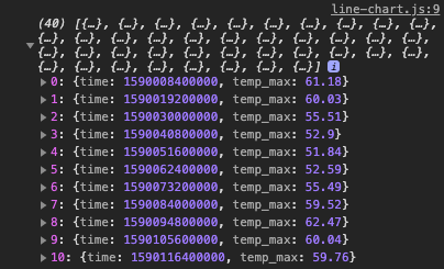
}Our data - called chartData - will be coming in as an array of objects with two keys: temp_max and time, looking like this:
// javascript
[
    {
        temp_max: 62.4,
        time: 1589749200000
    },
    // [...]
]The yScale is set with D3's scaleLinear method. This method basically maps the lowest and highest values of a dataset to the height of the Y axis in our chart. The domain method tells us to take the lowest to highest temp_max values in our array, and map it to our range which is 0 to the height of our chart (plus 10 to give a little space over the highest point that our line will reach).
xScale is working similarily, setting a scale to our time values and mapping it from 0 to the width of the chart. Creating the scale with scaleTime() rather than scaleLinear() gives us access to special time-based values, while the latter function returns a linear series of integers.
The scales are mapping objects that will be used in the next steps, so they don't produce anything in our HTML yet.
5. Adding points for the line
We'll come back to another SVG method, this time to place dots across the chart for each time and temperature intersection. Let's add this to drawChart:
// javascript
export function drawChart(chartData) {

  // [...]

  // 5. Append dots for each temperature
  svg.selectAll('.dot')
      .data(chartData)
      .enter().append('circle')
      .attr('class', 'dot')
      .attr('cx', (d) => xScale(d.time))
      .attr('cy', (d) => yScale(d.temp_max))
      .attr('r', 2);
}This is where D3 can be tricky to reason out. It starts with selectAll, which says to select elements with the CSS class .dot, but we don't have elements with that class until further down the chain (I'm thinking of it like the way SELECT comes first in a SQL query before you indicate the table to select from).
We're declaring that our data is the chartData we're sending into the function. enter signals that new elements need to be added to the SVG, and append('circle') indicates what elements to add. It will add one circle for each item in the chartData array (If you're confused, and I don't blame you, this explanation of enter and exit in D3 is helpful).
Now, each circle will have the CSS class .dot (selected in the first step). The final SVG attributes that we are adding are 'cx' and 'cy'which are the circle's X and Y axis locations, then r which is the radius of the circle. Notice that the xScale and yScale functions from earlier are used to take the time and temperature values and map them to an x,y location for each circle.
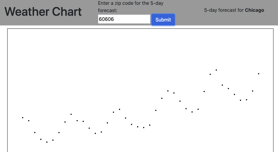
If we refresh our page and submit another zip code, we'll see a series of dots across the line chart area:

Likewise, all of our circles will have been added to the SVG:
6. Connecting the points
Next, we'll draw a line to connect the circles:
// javascript
export function drawChart(chartData) {

  // [...]
    const line = d3.line()
        .x(d => xScale(d.time))
        .y(d => yScale(d.temp_max));
}d3.line() returns a function that will output the X,Y coordinates for our line to follow, and we're indicating that the time and temp_max properties will determine those values. The output of the d3.line() function is an SVG path string: a string of commands for a path to follow.
To actually draw the line, we'll add a <path> element to the SVG:
// javascript
export function drawChart(chartData) {

  // [...]
    svg.append('path')
        .datum(chartData)
        .attr('d', line)
        .attr('class', 'line');
}We are appending the path to the SVG, indicating that chartData is our data, and using the output of line to set the path's d attribute (apparently d stands for data). Lastly, we are adding a CSS class called 'line' that sets the appearance of the line. In main.css, this is how I styled the line in the boilerplate, but play around with it as you'd like:
/* css */
.line {
    fill: none;
    stroke: steelblue;
    stroke-width: 1;
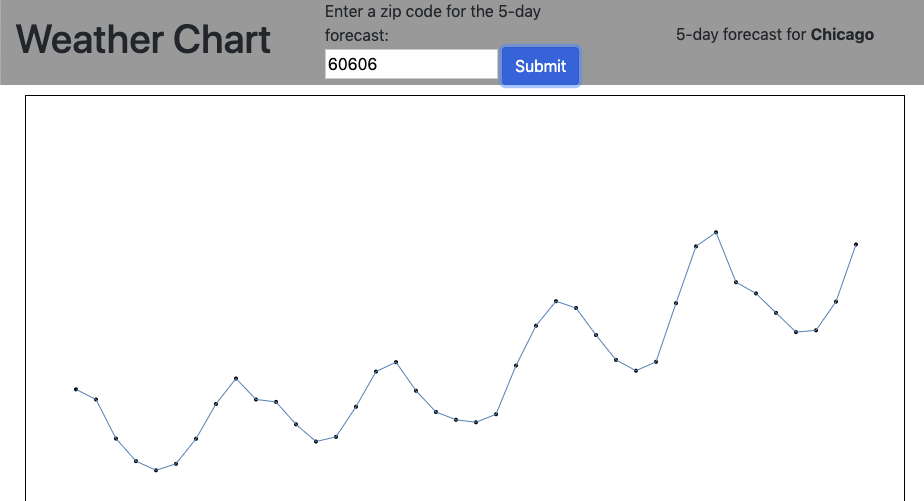
}Now if you refresh the browser and submit another zip code, a line will connect the dots:

7. Adding the Labels
Our line doesn't make much sense without axis labels. We will append two more groups (<g>) to our SVG to indicate the time of day for every six hours on the X axis:
// javascript
export function drawChart(chartData) {

  // [...]

  svg.append('g')
      .attr('transform', 'translate(0,' + height + ')')
      .call(d3.axisBottom(xScale)
      .ticks(d3.timeHour.every(6)));
}First we push the object to the bottom of the SVG with a translate command, then we use the mapping in the xScale function to determine the values, while the ticks set the intervals.
The append command for the Y-axis is a little bit simpler to add, but more involved under the hood:
// javascript
export function drawChart(chartData) {

  // [...]
  svg.append('g')
      .call(d3.axisLeft(yScale))
}For each item in the array that yScale outputs, D3 is adding a vertical align, then an SVG <text> element at every interval set by the yScale array. The D3 Axis Methods are worth getting more familiar with as they save a lot of tedious work with setting up axis labels.
A final missing piece is that our viewer has no idea what our Y-axis numbers represent. Our last touch is to add a 'Temperature (F)' label. We'll extend the last append function further:
// javascript
export function drawChart(chartData) {

  // [...]
svg.append('g')
      .call(d3.axisLeft(yScale))
      .append('text')
      .attr('fill', '#000000')
      .text('Temperature (F)')
      .attr('transform', 'rotate(-90)')
      .attr('y', 5)
      .attr('dy', '0.71em')
      .attr('text-anchor', 'end');
}The append('text') and everything that follows is simply manually setting the attributes of an additional SVG <text> element.
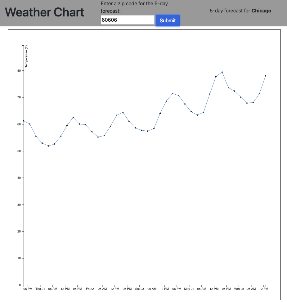
And now we've got our line chart:

Conclusion
And with the above function, you've got an SVG that dynamically reacts to different data sets that are sent to it. By manipulating SVG elements, setting scales, and leveraging some of D3's extensive functions for manipulating and rendering data, you can see the level of detail that can be applied to creating visualizations with raw data. We get a sense of the process of setting up a D3 visualization that we can experiment with further, as well as study the thousands of other impressive D3 data illustration and creative coding that are out there.